
Presentation at the Plan Awards.
The studio work for the Re-invention of Public Housing was shortlisted in the category ‘Future Housing’ at the Plan Awards for 2015. Frederick Biehle presented the work to a panel of Italian and European architects as a part of the Perspective Europe 2015 event at the Milano Congressi. The project was also included in a larger exhibition of all shortlisted projects.
http://awards.theplan.it/index.php/house-26/620-pratt-institute

While in Milan, FB visited the newly celebrated Prada Foundation by OMA. He had this to say about it-
The walk to the new Prada foundation in Milan from the metro is a bit cinematic. It’s true that the neighborhood and the distance combine to introduce a glimmer of doubt as to whether one is in fact going in the right direction. So the pronouncement of the true way by a series of highway scale billboards, each calling out a section of the foundation grounds, is helpful. They also set up a certain episodic sensibility to the approach. The distinctive images become sequential focal points along an otherwise anonymous roadway. By the time of arrival I am conscious of the fact that the foundation campus is a collection of buildings, each different and developed internally as a uniquely inspired stand-alone statement, but still part of a group.
In passing through the entrance gate my first reaction is that the foundation’s focus was on its architectural space, perhaps because no particular piece of the architecture informed me of where to move next and the use of cladding was equally devoid of any sense of hierarchy. I remembered a comment from Koolhaus in a recent article about the Prada-
For a couple of years now, I have been... well, I don’t know what the best word is, but it is somewhere between bored and irritated, by the current course of architecture forcing people to be extravagant even if they don’t want or need that. I think there is a fatigue with “originality” now and an interest in the modesty of an artist. In this case, this was important for me as it allowed us to find a new relationship with architecture. It was more interesting than saying “Prada”1
My next thought went immediately to Carlo Scarpa. Perhaps due to the larger generic similarities between this and his Castelvecchio Museum – the setting a preexisting walled compound, the indoor-outdoor sequence of visitation, and the impact of material and detail in determining the spatial character and meaning of the place. Not so much the suspended confrontation between new and old that was being talked about, I began to see the project as an outright challenge to Scarpa’s humanism, confronting his serious cognizance of the viewer/inhabitant with a new more contemporary disinterested disregard.
Entering at the north east corner, one needs to be directed to the gold building, called the “haunted house”, so as to purchase an entry ticket. This allows the outdoor space within the wall of the foundation to operate as a privately owned public space. As I approach I realize that the gold building certainly declares its importance within the site, not because of its being a five story 19th century structure, one of the complexes tallest, but because it has been gold leafed in its entirety. Wow, gold leaf, there is a material you don’t see being used in contemporary architecture. Interestingly Scarpa was not afraid of gold either. He used it in his glass works, and he used it in his architecture as well, with gold leafed mosaic tile. He had seen it throughout the shimmering Basilica of S. Marco in Venice, he knew its power to hold and reflect light. But this is different. Not unlike some of the other materials we have seen upon entry, the cast aluminum panels for instance, the material is being used as if it is something banal, a literal coat of paint. It is a precious and costly material but it has been applied uniformly to every surface of the building, including window frames, window muntins, and even the drain pipe. Shirley Eaton, the actress was similarly coated in gold paint for the 1964 James Bond movie Goldfinger. The intention, in the movie, was to asphyxiate her, to kill her off provocatively. It worked in the movie. Is the gold leaf here likewise intended as a suffocating provocation? Of course it works, particularly when its outrageousness is contrasted with the neutral grey Prada outfits and stoic slightly disinterested expressions of the security staff.
Going back to Scarpa, I imagine him surgically locating his delaminations and revealings within the Castelvecchio complex. Even though there must have been a certain disregard for the work of the renovation architect who had imported a new fictional gothic style to the original barracks, Scarpa effectively learned from him by recrafting and framing his overlay. Koolhaus paints over the original. He covers it up. He makes it stand out with an act normally intended to make something go away. (I am slightly abhorred by this, but likewise think that I am supposed to be, or at least impressed- and in fact I am. I just wish it actually meant something other than how to locate the front door.)

Scarpa at the Abatellis Museum in Palermo
We should think of it as an intentional introduction of color to denote importance. I am reminded again of Carlo Scarpa, this time the Abatellis Museum in Palermo, one of his earliest museum works, in which he lays out his already quite mature episodic intervention with an ever more diversified and recurrent palette of invented and reconsidered materials. In particular I remember how he too used color as a way to call attention, to arrest the unsuspecting focus of the viewer that might very well pass by the museums most recognized masterpiece, the 15th-century Bust of a Gentlewoman (attr. Eleanor of Aragon), a small work of great subtlety and quality. Scarpa frames the work by back paneling it with his signature stucco lustro veneziana, but in a totally incongruous color, green. The stucco panels are framed in a minimal bronze angle, and suspended along the existing walls, clearly an application over and in front of something prior and older. The panels define a corner as well, allowing it to be understood in relationship to more than one perspective. So in the immediate sense it is located in relationship to a nearly incongruous color with serves as a larger scale frame, to monumentalize a small work, and allow it to be viewed three dimensionally still, on all sides, and in specific relationship to natural light, which falls from the adjacent window. This is an immediate circumstance that is constantly changing. Due to position, time of day, season, temperature. It offers an intensely humanist exchange, between object and viewer. And it also situates itself within an even larger episodic sequence, nearly centered on the arched opening of the prior gallery.
The subtlety of such an orchestrated maneuver is quite impressive. But it was also in the way that his specific choices, between location, position, color, orientation, and scale came together so as to communicate a specific meaning. Here there was a certain quiet celebration, even a memorializing taking place- of the artist? Of the figure? Of the viewer’s ability to discover this? The place took on a nearly spiritual aura.
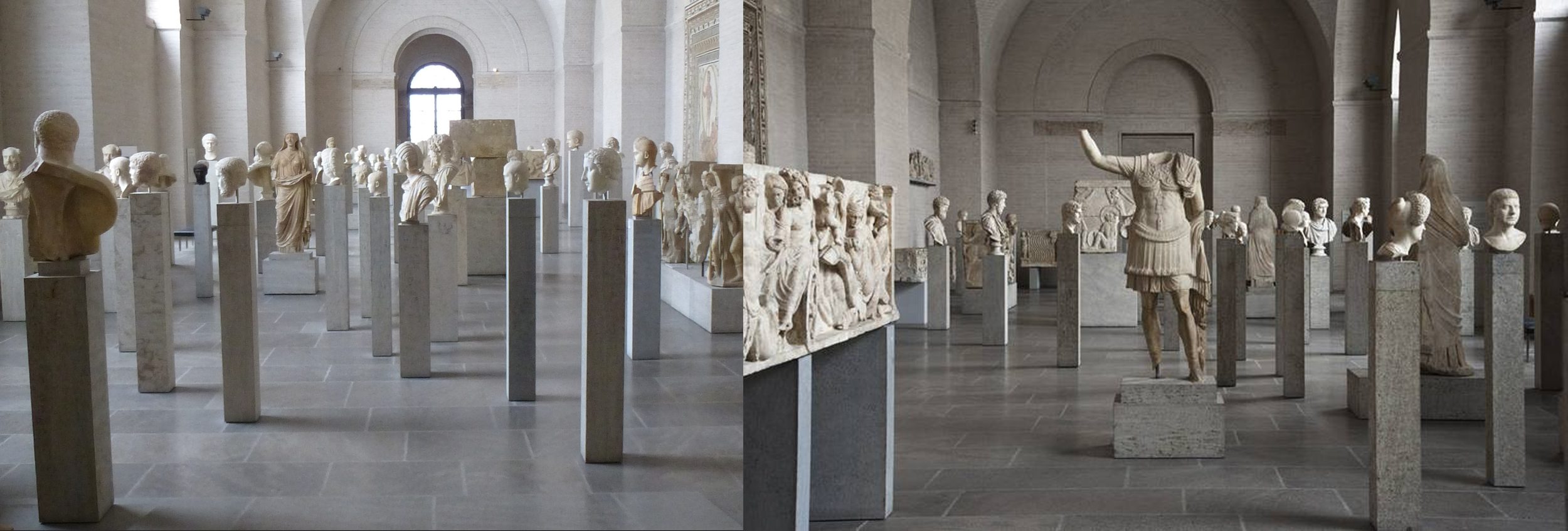
GlypGlyptotech, Hall of Roman Busts
Another of my favorite museums is the Glyptotech in Munich. The Leo von Klenz’ masterpiece took 40 years to finally renovate following World War II, opening eventually in 1980. The duration and slowness of the project allowed architectural tastes and priorities to change, from the rational to the personal and the museum that emerged from the long process benefitted enormously. In the application (or non-application) of materials like the thinly whitewashed exposed brick interiors to the strategy for display as an agitated contrasting arrangement of sculptural works that works contrapuntally with the clear progression of geometrically symmetrical rooms around a central courtyard. One of my favorite rooms is the space for the roman busts. Quite a number of museums contain a plethora of this common roman artifact and it often shows in the manner of their display. Not so here. The seeming disorder of the display is a scarpaesque strategy of episodic management that overlaps its sequences together with a kind of fully random rollypollywholover invented by John Cage for his exhibition.

Corsini Gallery South Gallery, Prada Foundation
Koolhaus contributes to this by again referencing something eminently more banal. The space of storage itself. The Corsini Gallery in Rome is an example where the wall space is effectively inadequate for the number of works that either need or want to be displayed. Salon style is what this method of hanging has been called. But here, in the South Gallery it has been exaggerated, the negative space between works is intentionally not exploited and the actual relationship between works made to be equally limited. It is nothing more than a useful place to keep these works together. Roping the room off to prevent a closer inspection simply emphasizes the point. It’s not for people really.
It might then seem that the characteristics of the foundation are really very much the same the clothing label- industrial, intentionally awkward, not really for the body. In the end maybe Koolhaus wasn’t being fully truthful, because for anyone listening it says nothing but “Prada”.


