Frederick Biehle Erika Hinrichs viaARCHITECTURE prioritizes space, light, and material so as to offer you the essence of interiority.

 
Rendering Visualization

URBANspaces

Multi-family housing conversions, affordable housing design, and extensive research into decolonizing the NYCHA superblock and reintegrating it urbanistically.

Creative Workspace Solutions - fabricated metal panels and colorful acrylic

LIVINGspaces

Townhomes and apartments in Manhattan and Brooklyn, homes on Long Island, Shelter Island, and Westchester County, we have designed comfortable and livable environments that aspire to address the art of dwelling.

Render Visualization of interior - custom furniture design and cabinetry

workspaces

Not-for-profit; publishing; restaurants; fashion including designers, modeling agencies, and retailers; advertising agencies as well as commercial offices- we approach every project with the same sense of spatial care and clarity of detail.


A man-made clearing, a space that allows for an interface between the earth and sky.

In classical antiquity, the oracle was thought to be the mystical portal through which the gods could speak directly to the people.

This proposal is shaped as a man-made clearing, a space that allows for an interface between the earth and the sky, the vertical axis that can intersect with the horizon and the extended parallel path that will traverse the Great Kemeri Bog.

It is a space that allows for the gathering of knowledge through its visitor center exhibition and a place of respite as a kind of oasis that offers regeneration.

The enclosing walls are fabricated in faceted sections from Shou Sugi Ban charred wood, a finishing system invented in Japan that naturally preserves the material. It is set up to act as a scrim, a surface that both filters the condition that lies beyond it while allowing natural light to enter in.

 
The teak wall of the bedroom works together with a white museum zephyr bench and George Nakashima cherry headboard.
The vaulted ceiling appears to disappear until the light casts exaggerated shadows across the length of the space from bedroom to living room.
 

housing must be ordinary, something that recedes into the fabric of the city, and not something that stands forward from it.

The 1960s saw both a rejection of the monumental vision for public housing and a dissolution of the political responsibility to continue creating it. Aldo Rossi’s critique was at the center of the European rejection- Architecture of the City was a protest against the aesthetic functionalism that had been embraced by the public housing industry. Rossi declared that residential buildings are fabric, not monuments, and only by continuing to be fabric can they make a positive contribution to the city as a collective work.

The principal argument against public housing in western democracies has been the cost- which proved to be the critical underlying factor that allowed municipalities to embrace the unproven demolition and high rise construction methodologies. In the US, the result was both the destruction of historically cohesive neighborhoods and the creation of anomalous and stigmatized urban landscapes, anti-urban islands within the city.

The Victoria State Government established its Housing Commission in 1938. In spite of the failure of tower-in-the-park modernism in both America and Europe and the success of its own prefabrication plants, it would choose to abandon its lower rise, higher density track record for Melbourne. Between 1964 and 1970 twenty-eight sites across nineteen suburbs in inner Melbourne would be cleared and developed with forty-seven 20-30 story high rise housing blocks situated in unadorned natural landscapes.

Today, however, these superblock sites can offer a different opportunity- because the land is already publicly owned, one of the principal economic obstacles has been eliminated. Secondly, each of the sites open spaces can benefit from a de-suburbanization, The construction of a low-rise perimeter block apron of new affordable housing can better integrate each of the sites with its surrounding urban condition.

This proposal provides new affordable housing by re-urbanizing Melbourne’s public housing sites- introducing a new low-rise infill to both engage the surrounding streets, integrate certain commercial and retail adjacencies, offer 2 nd floor amenities and services for the larger constituency and better define its landscapes, the now intra-block gardens, to better allow for recreational leisure.

 
The teak wall of the bedroom works together with a white museum zephyr bench and George Nakashima cherry headboard.
The vaulted ceiling appears to disappear until the light casts exaggerated shadows across the length of the space from bedroom to living room.
 

A FULL FLOOR LOFT ON LOWER BROADWAY FOR A YOUNG COUPLE WITH TWO CHILDREN AND A COLLECTION OF MODERN FURNITURE.

The design was intentionally minimal emphasizing the layered planes that apportion and subdivide the space. The nature of materials became a focus- rosewood paneling in the living-dining area, and teak in the bedroom. the plaster vaults of the ceiling were allowed to continue through and the bathrooms were considered as variations of white on white.

 
The teak wall of the bedroom works together with a white museum zephyr bench and George Nakashima cherry headboard.
The vaulted ceiling appears to disappear until the light casts exaggerated shadows across the length of the space from bedroom to living room.
View looking towards the rosewood panels in the kitchen. Details of the screen on the left proves that formally: repetition of familiar elements is anything other than boring and functionally: divides the space providing a clear distinction between …
 

One full and one partial floor in a five story brick manufacturing building in West SOHO reinvented as creative studios, sales offices, and showrooms for a designer/manufacturer of silk fashions.

As the clothing designers pattern must be placed onto the flat surface in order to be cut, so too does the figural pattern of this showroom unfold. Private spaces for each of the two partners can be recognized at opposite lengths by identical bent wood walls. The two exhibition showrooms, the projects physical center and visual focus are always open through the transparency of their steel and glass walls. Ten private office areas form the perimeter. 

 
Figural patterns of the showroom unfold in the exhibition showroom. The two exhibition showrooms, the projects physical center and visual focus are always open through the transparency of their steel and glass walls.
Ten private office areas form around the perimeter of the showroom. Strategic cuts are made in the wood partition walls in order to focus the view as well as juxtapose the sheer size of the wall with thin, careful incisions.
 

CONVERSION OF THE TOP TWO FLOORS AND ROOF OF A WEST VILLAGE WALK UP TO PROVIDE LIVING AND WORKING SPACE FOR A YOUNG FILM-MAKER AND HIS FAMILY.

The program requirements were quite brief, simply to open the space and insert the idea of "loft" into the irregular configuration of a century old residential building. But to also include a master bedroom that could be isolated from the rest of the apartment, an interior sanctuary. The concept began by reducing the space to its most essential terms, 3500 square feet on two levels with windows on all four elevations. The interior walls were stripped back to the masonry shell, which was kept exposed along with the heavy timber lintels over the windows. Absolute level was introduced with a new walnut wide plank floor and a lath and plaster ceiling, thus fixing the space's perimeter. Proportionally elongated, the design then interjected distinctively different moments, a series of architectural tableaux that when linked by the sequence of use, could make for a variety of episodic experiences. 

 
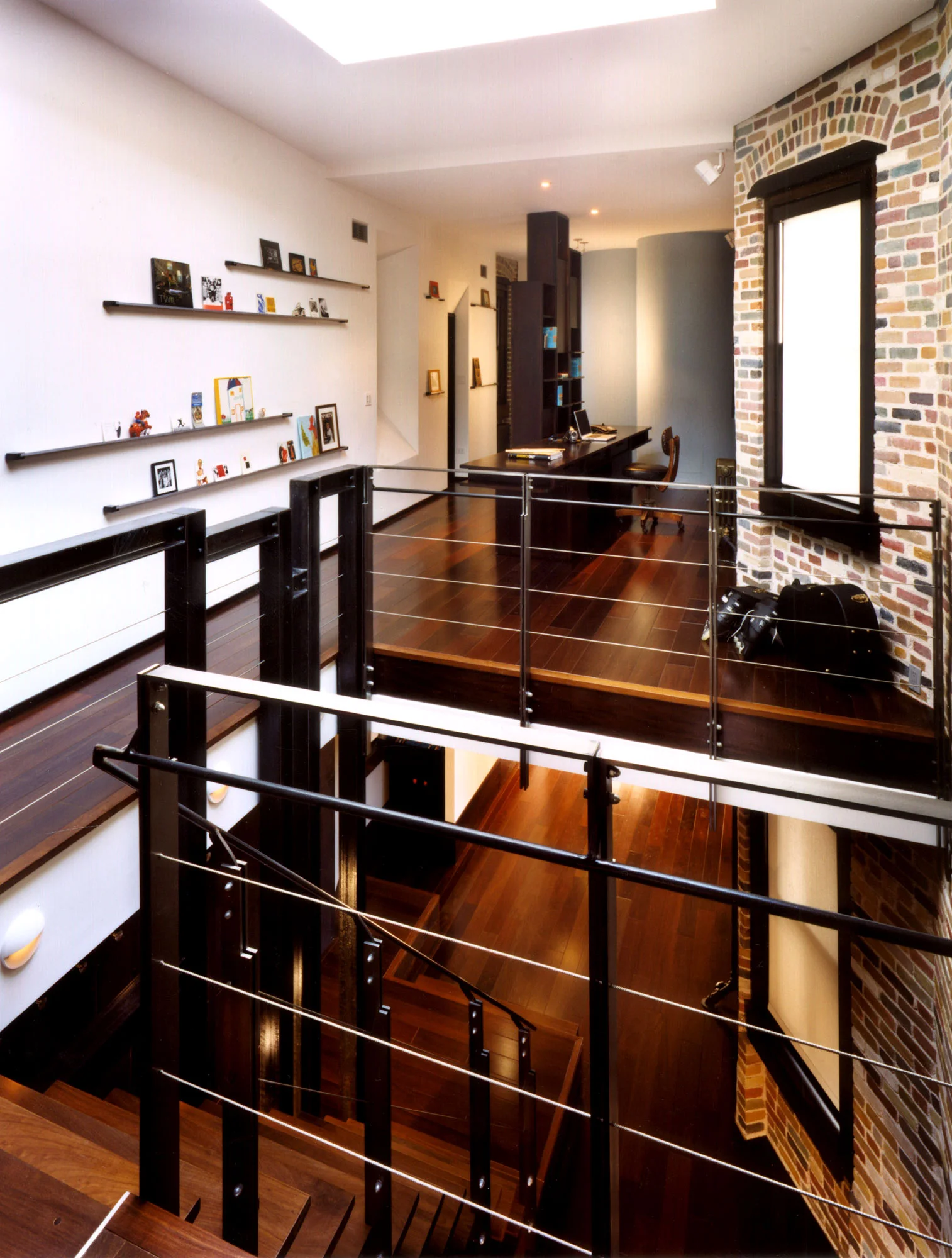
Interior view of duplex designed with custom steel railings. View into the office space featuring wood floors, exposed brick walls, and skylight.
Interior view from foot of custom steel staircase looking towards the mosaic tiles of the bathroom. Obscured from view by the frosted, opaque glass encased in wood.
©MichaelMoran_viaARCHITECTURE_ConnorsDuplex_StairDetail2.jpg
©MichaelMoran_viaARCHITECTURE_ConnorsDuplex_StairDetail1.jpg
 

A 1949 ESTATE HOME FACING ONTO THE CHAGRIN RIVER IN NORTHERN OHIO RENOVATED FOR A YOUNGER ATHLETIC FAMILY

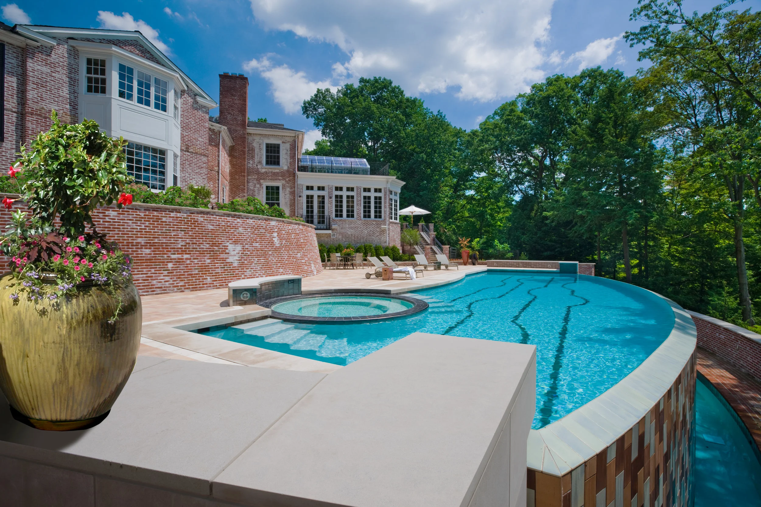
The project was executed in four phases all intended to deformalize it, opening it to light and movement while still being able to display a growing art collection: The ground floor public spaces including an atrium, formal and informal living rooms, a dining room, study and billiard room. The 2500 sf master bedroom suite including his and her bathroom and dressing rooms, a second study, an exercise area and a bedroom proper with both sitting and art viewing areas. The kitchen with addition and utilitarian spaces - wine cellar, pool changing room and garage entrance. The exterior pool addition with disappearing edge looking over the sloping terrain toward the river.

 
View looking into the living room towards the fireplace. The opaque glass encased by wood creates a partition of space and a focal point for the screen wall. The minimal, stone fireplace complements the simplicity of the screen.
View looking in from the front entrance towards the main staircase.
View looking out towards the garden under the monumental glass skylight. Natural light pours in, illuminating the exposed brickwork in a warm color. 
atrium.png
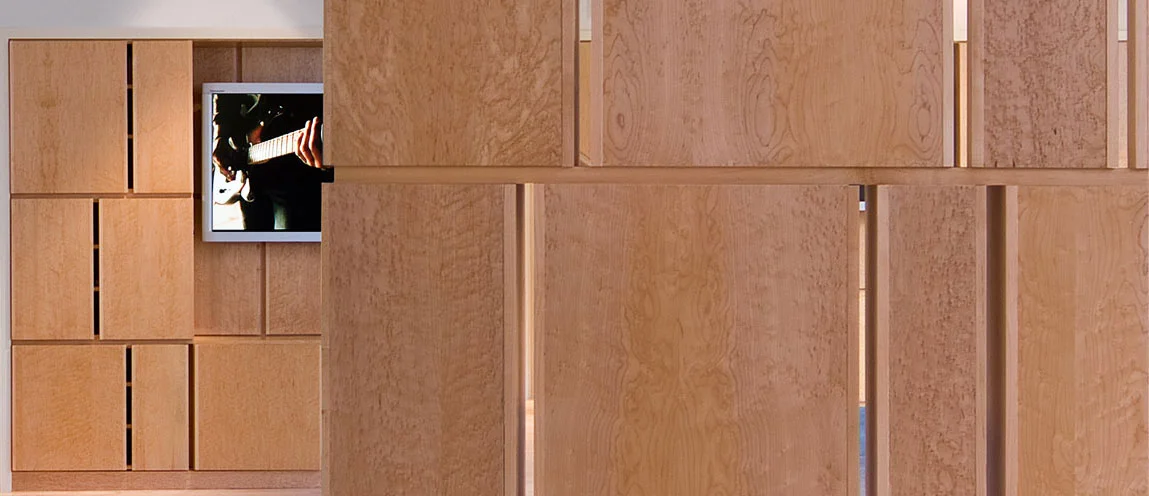
View from the bedroom looking out towards the wall partition. Custom vertical screen against the bed further partitions the space without closing it off to light or air.
dn.asp 5a.jpg
 

14TH FLOOR SOUTH FACING APARTMENT IN THE THIRD OF THREE RICHARD MEIER TOWERS ON THE FAR WEST SIDE OF GREENWICH VILLAGE.

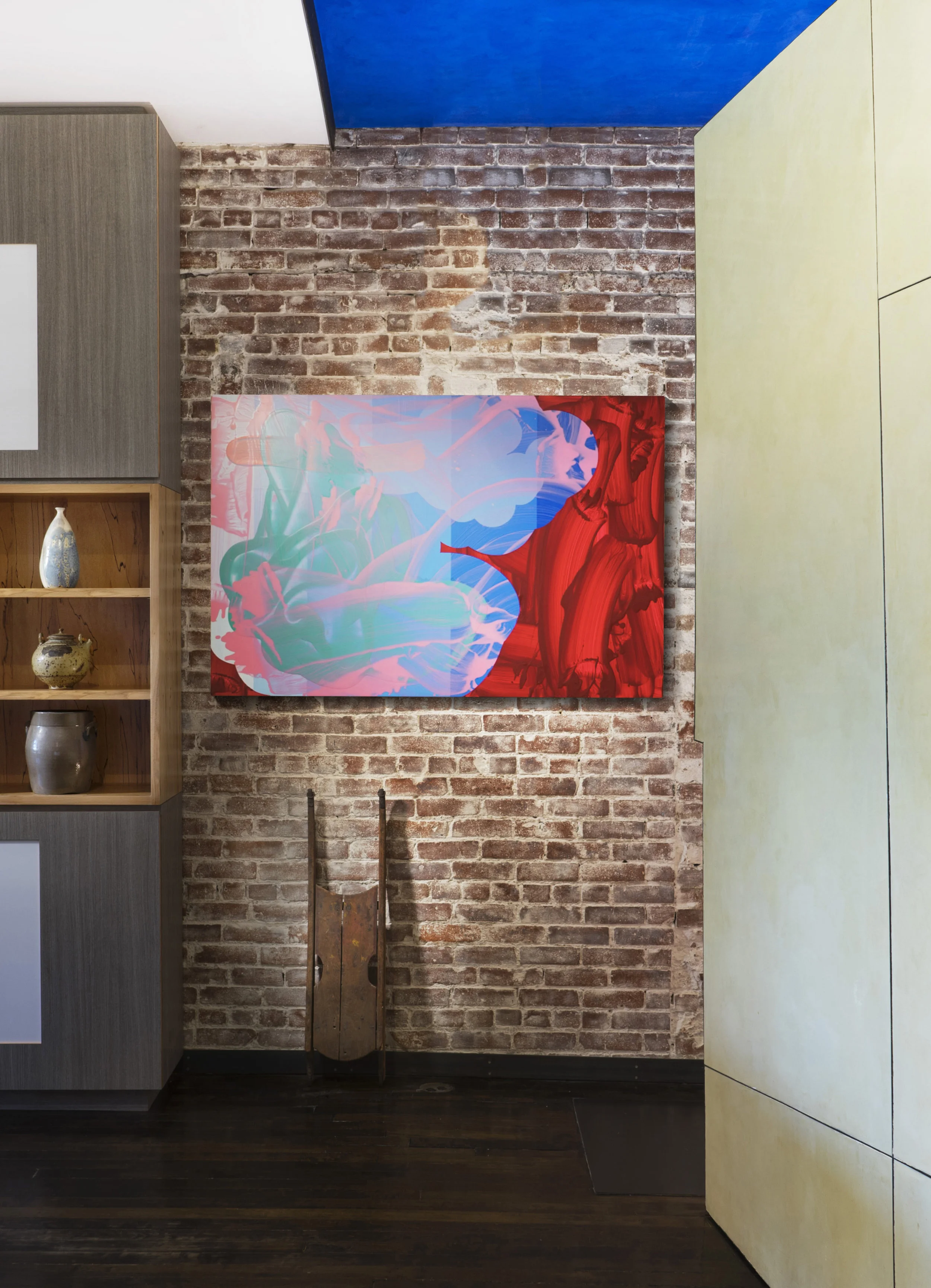
A project of discreet  interventions with furniture and cabinetry to offset the overwhelming whiteness of being. A deep red Venetian plaster wall greets ones arrival and extends the length of the space to the open living room. Easels and wall panels are set up to accommodate an ever changing collection of contemporary painting. 

 
A project of discreet  interventions with furniture and cabinetry to offset the overwhelming whiteness of being. A deep red Venetian plaster wall greets ones arrival and extends the length of the space to the open living room. Easels and wall p…
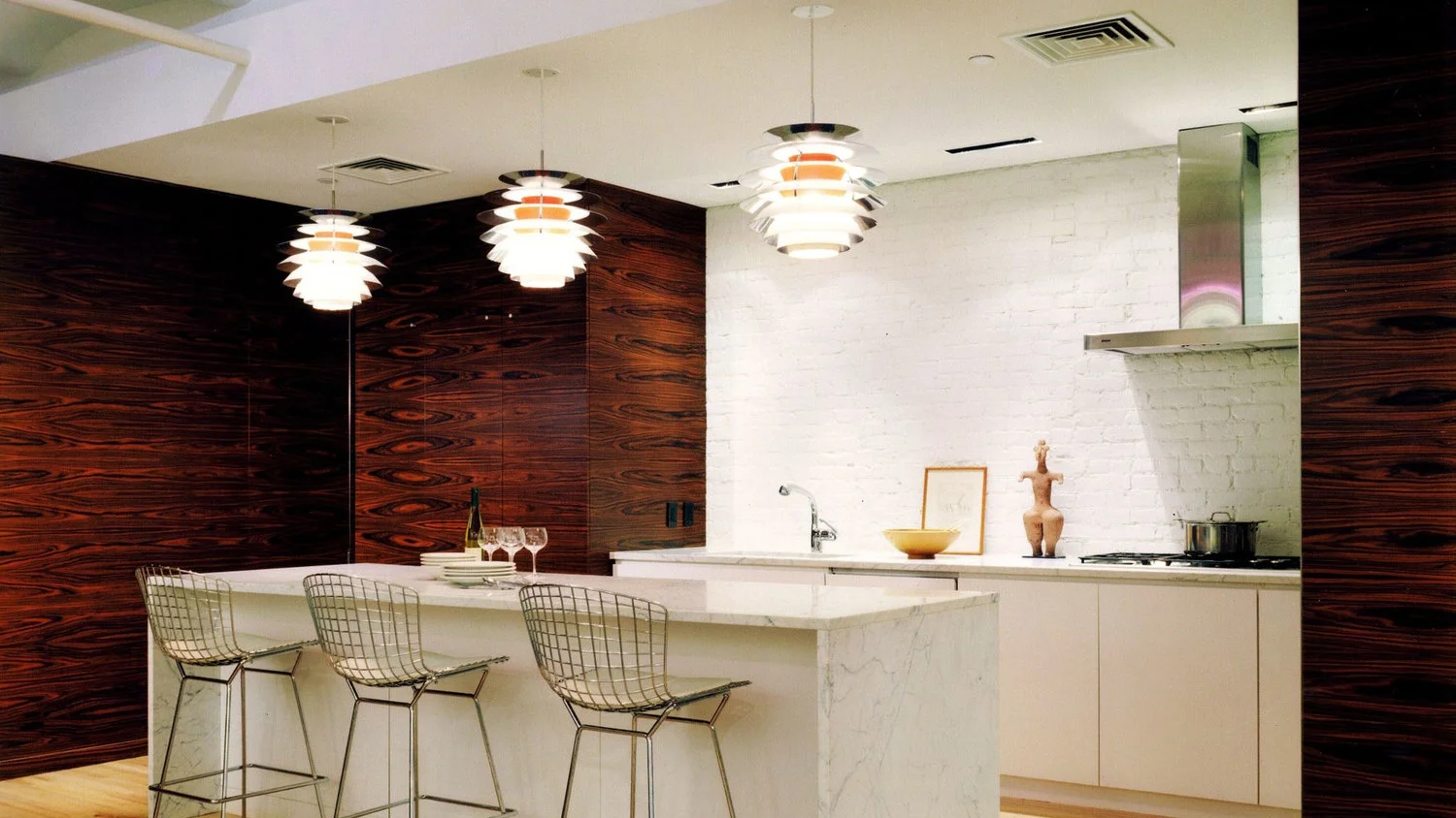
View from the dining room towards the kitchen. The staggered appearance of the custom cabinetry and shelving are conceptually similar to the easels; cycling through and accomodating the ever changing collection of art objects.  
 

AN ARTS FUNDING NOT-FOR PROFIT WITH 20 EMPLOYEES WILLING TO SHARE PRIVATE OFFICES AS A WAY TO GAIN MORE COMMUNAL SPACE FOR CONFERENCE ROOMS, FORMAL MEETING ROOMS AND INFORMAL GATHERING RELOCATED TO A FULL 17TH FLOOR IN OF AN OFFICE TOWER ON MAIDEN LANE JUST OFF OF BROADWAY IN LOWER MANHATTAN.

With windows on all four sides of the floor, the intention was to emphasize the loftyness of the space by allowing for repeated moments of visual access to the exterior windows. interior walls have multiple doors (all sliding pocket) and windows. the central conference room is punctuated by 8 openings and can be subdivided. There is a large screening room for films and presentations adjacent to the library.

The library is open to artists to stop by and use.
Each cabinet and shelving unit was carefully designed built-in in order to prioritize space.
The gradient pattern on the sliding door was computationally designed and controlled. Various parametric constraints such as proximity of holes, material allowance, and resolution showed variation in clarity of image.
 

A FAMILY TOWNHOUSE ON THE UPPER WEST SIDE GOES THROUGH FIVE PHASES OF WORK TO ACHIEVE THE PERFECT RESIDENCE.

Beginning with a glass and stainless steel balcony suspended over the rear garden, the project was one of progressively altering and modernizing the character of what had been a 1960s renovation to a turn-of-century classic townhouse. The last phase was the most extensive, removing the street level rental unit and opening the ground floor directly to the garden for dining, cooking and lounging.

Details of the screen wall against the stair provide a clever solution to space separation.The dining area can be seen with its staggered display shelving units. Graypants Studio Lighting
A monumental stone fireplace clad in six St. Laurent stone slabs with custom shelving adjacent on both sides of the fireplace provides additional storage.
DSC03453.jpg
 

RENOVATION OF A FULL FLOOR LOFT IN a converted match factory building to provide two bedrooms with lots of open space for a young family.

The apartment's private space was compressed and pushed to the rear behind a theatrical steel and Venetian plaster wall, prioritizing the residual space pointing toward the western view of the Hudson River and emphasizing its larger, open dimension.

Details of the screen wall against the stair provide a clever solution to space separation.The dining area can be seen with its staggered display shelving units. Graypants Studio Lighting
A monumental stone fireplace clad in six St. Laurent stone slabs with custom shelving adjacent on both sides of the fireplace provides additional storage.
01_40 Hudson.jpg
 

COMBINING TWO ADJOINING APARTMENTS IN AN HISTORIC DOORMAN BUILDING AT 86TH ST. AND MADISON AVENUE TO CREATE A NEW LARGER BUT LONGED FOR "SANCTUARY."

The intention was to establish a series of singularly unique spaces: a sprawling living room with a new fireplace where there previously was none, a media room all its own, a dining room with serving island and tucked away kitchen, a master suite with a five fixture bath, and an en-suite guest bedroom, all washed by Northern light.

DSC00515.png
Details of the screen wall against the stair provide a clever solution to space separation.The dining area can be seen with its staggered display shelving units. Graypants Studio Lighting
A monumental stone fireplace clad in six St. Laurent stone slabs with custom shelving adjacent on both sides of the fireplace provides additional storage.
 

RENOVATION OF A 1250 SF COTTAGE INCLUDING A 1970'S ADDITION TOGETHER WITH A 1250 SF ADDITION WITH OUTDOOR TERRACE AND SWIMMING POOL ON AN INLAND LOCATION ON SHELTER ISLAND.

Some relationship to the original evolution of the property has been embedded in the architecture: the original cottage was opened up vertically and clad with painted pine. It now contains the open kitchen and dining area and a guest bedroom. The 1970's addition is made to be a more emphatic "Great Room;" introduces flat plaster painted walls but retaining the painted pine open ceiling and adding a fireplace. A tower at the corner adjoins a new front porch and entry. The bedroom wing addition initiates the framing of the outdoor court with swimming pool.

DSCF2375.JPG
Details of the screen wall against the stair provide a clever solution to space separation.The dining area can be seen with its staggered display shelving units. Graypants Studio Lighting
A monumental stone fireplace clad in six St. Laurent stone slabs with custom shelving adjacent on both sides of the fireplace provides additional storage.